Sometimes we come across things that, until we see an alternative, we don’t realize there’s something better than the current option. I had this direct experience when I moved into my current apartment in August, and tried to cook for the first time.
Oftentimes we get stuck thinking about UX or UI in context of software design. Donald Norman’s book The Design of Everyday Things takes a look at how the design of objects in the physical world can affect our experience using those objects, and it forever changed the way I look at the world. The Design in the Wild (DITW) series is my personal look at my encounters with various objects in the physical world and what their design tells us.
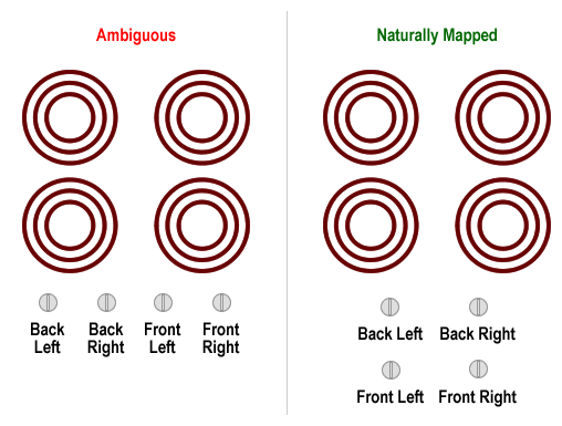
Everyone, at one point or another, has at least seen a stovetop. Hopefully, most of us have used a stovetop at some point in our lives. Think back to the very first time you did this. How long did it take you to figure out which knob related to which burner? How many times, when you were first starting to cook, would you accidentally turn on the wrong burner at first? What we’re discussing here is a failure of mapping. Mapping is a concept in usability that relates the controls to the outputs.
In most cases, stovetops provide a linear set of controls (the knobs, in a row) in order to map onto a 2-D set of outputs (the burners, on a grid). Sometimes you’re lucky enough to have a light to tell you if there’s a hot surface, as well, like so:
My current apartment’s kitchen has something I don’t recall seeing before, and it makes the cooking experience so much easier:
There are several small features about this range that make so much more sense than the traditional setup. For one, the knobs are laid out the same way the burners are, so I don’t even have to think about or ask which knob controls which burner. It’s self-evident. There are also four individual lights - one for each burner. The self-evidence is wonderful. The only real complaint I have about this range is that these four lights could be slightly more useful if they a) stayed on after I turned the burner off for as long as that burner was hot, and/or b) had a dimmer to tell me how hot the burner was. If I put it on 1 or on 7, I get the same amount of light. Beggars can’t be choosers, though.
As it turns out, this exact example of mapping was discussed by Donald Norman himself in the Design of Everyday Things. In fact, that’s where the header image comes from. So this idea is far from new. The bigger question, though, is why it hasn’t been put into practice. I can’t imagine there’s a lot of inertia preventing this change. If anything, being stuck in our own ways is holding us back from a more intuitive cooking experience.
All User Experience posts:
- User Research 101
- Research Playbooks: What Are They and Why You Should Have One
- Building a UX Department from scratch at a 20-year-old Big Data Company
- A Designer's Guide to GDPR
- Improvisation, Creativity, and Design
- The Importance of (Daily) Technique
- An Intro to Embodied Cognition
- Usability Research Checklist
- UX Considerations For IoT
- The Dangers of Tight Iteration
- Product vs Project Management
- Transparency of "Online"
- An Open Letter to OkCupid
- The Importance of Flow
- Note-taking
- The Importance of Content
- DITW: Stovetop