Internet of Things (IoT) has been all the rage for a hot second as more and more companies try to bring their devices online and increase access (and functionality) to customers, but it’s far too easy for things to go wrong. After working through these problems on a few projects and seeing the same issues come up, I figured it’s about time to write out some of the main things to consider when designing for IoT.
Connectivity
The internet is a fragile, beautiful thing.
When I first wrote this, I put this section somewhere in the middle, but as I thought about it more, this is easily the most important thing. There’s a certain allure when it comes to IoT of being able to completely eliminate all physical interaction with the device and push that all off to the cloud/your app. Just imagine it: smooth, sleek lines with no buttons or ports or anything to disturb it.
If you get nothing else from this post, it’s that this is probably one of the worst ideas plaguing IoT today.
Assuming your device will be able to connect to the user’s phone (whether via Bluetooth or WiFi), their network, and then through the cloud to your server is incredibly dangerous. Signal strength, network type, outages, and just plain internet gremlins can render your device completely useless. And there’s nothing people hate more than a $100+ paperweight.
In one set of usability studies, the first task we gave users was to turn on a coffeemaker and brew a pot of coffee. Luckily, this design actually had a manual start/stop button, so users weren’t completely stuck. However, the mere existence of a red WiFi light on the device made the majority of users assume they needed to connect it to the internet in order to brew, and well over 80% of the users tested couldn’t figure out how to do that without help. The frustration expressed by users (in the middle of the day, mind you, not even at 6am when they desperately need coffee) was incredible.
We ran into one issue where, for some reason, a beta user was having trouble connecting to their internet. Our device could see the network, and it was getting the credentials properly, but for some reason it wouldn’t connect. After doing some testing in our lab, we had to go back to the user and ask them whether their router was broadcasting at 2.4GHz or 5GHz, as apparently the wireless component we’d selected didn’t recognize 5GHz. We’ve also run into problems with WEP vs. WPA and Enterprise vs. Personal.
If you don’t want to put a physical interface on the device, that I can understand. The additional cost of components and programming to make that work might not be worth it. However, there’s virtually nothing stopping you from adding a MicroUSB port that would allow users to hard-wire into the device (from their phone or a computer) and control/interact with it that way. Yes, I know, how archaic, but I guarantee users would rather have that option than to be completely stuck.
The other (minor) issue with being internet-based is latency. If I’m standing next to my device and I change a setting, I expect to see that reflected almost instantly (because, to me, it’s right next to me). Nevermind the fact that it has to go from my phone through the internet to your server and then back through the internet to the device. The best way I’ve seen to deal with this is to show a waiting/loading indication on the app until you can confirm the device has received the instruction. That way, at least, users know the system is still working.
Tech Literacy
Don’t assume your users know what you know.
This might sound a little obvious (admittedly, most of these might), but it’s particularly true when it comes to IoT. As we broaden the userbase of technology, we need to be careful of the assumptions we make about our users. If you’re designing something for use in the home, you’re going to have a wide variety of age groups and technical literacies.
In several instances, we’ve run into issues where giving what we assumed was a simple instruction (e.g. “Connect to the Classic-XXXX WiFi network”) turned out as something some users were unfamiliar with. The solution there is to either spell it out in more detail for all users (“Step 1: Go to WiFi Settings, Step 2: Select the network named Classic-XXXX where the Xs are four digits”, etc.) or provide an easily identifiable “Help” mechanism for users that need it.
One particularly effective way of providing that additional help is to make a short animated GIF walkthrough showing the user how to do what they need to do. Doing this not only lets you describe the steps needed but actually shows the user what it looks like. The caveat here is that if you’re directing users outside your app, you have no control over what the system settings look like. Also, obviously, iOS and Android are going to look very different, so you’ll need to at least provide two animations.
The other thing to be aware of here is that literacy extends beyond just tech. If your industry has any specific language that a common user wouldn’t know, find a way to speak the user’s language. When I first started working with Therma-Stor, they were throwing around dehumidifier-specific terminology like “deadband” and “dew point”. I’ve certainly heard the term “dew point” before, but I have no idea what it actually means in the context of keeping my home safe, and I had no idea what deadband was. Find a way to either express things in a way a common user can understand, or simply hide the functionality and set a smart default.
Brand Consistency
Make it feel like a holistic experience.
I’m not going to talk at length about brand consistency in and of itself (google it), but I did want to touch on how important it is in the context of IoT.
Your users are already going to be in an unfamiliar place as they try to set up and then interact with your device, especially if it’s an existing product (or if you have existing similar products). One of the biggest mistakes I see companies making is to just assume you can take the experience as it was before and translate it 1:1 to the digital realm. Consistent is not identical.
Product packaging, instructions, in-app messaging, emails; these are all things you need to consider and to make sure they’re in line with your overall brand. This is something Therma-Stor did incredibly well: even the paper quick-start guide has the same look and feel as the app, and the physical device is also consistently branded.
It might not seem like much, but the more you can do to make the experience feel holistic, the less likely your users are to get lost or confused. If you happen upon an instruction manual or a certain screen on the app that doesn’t feel like the rest, users are going to assume they’re in the wrong place even if everything is working as planned. Not to mention it gives everything a sense of intention and polish that gives an overall impression of quality.
I truly believe in the power of IoT (when done right) to bring delightful experiences to users. If you’re working on (or thinking about) creating something new or bringing an existing product online, feel free to reach out and let’s chat about how to make that experience the best it can.
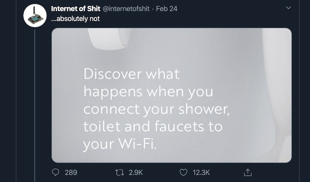
P.S. If you’re in need of a good laugh when it comes to IoT blunders, check out Internet of Shit on Twitter.
All User Experience posts:
- User Research 101
- Research Playbooks: What Are They and Why You Should Have One
- Building a UX Department from scratch at a 20-year-old Big Data Company
- A Designer's Guide to GDPR
- Improvisation, Creativity, and Design
- The Importance of (Daily) Technique
- An Intro to Embodied Cognition
- Usability Research Checklist
- UX Considerations For IoT
- The Dangers of Tight Iteration
- Product vs Project Management
- Transparency of "Online"
- An Open Letter to OkCupid
- The Importance of Flow
- Note-taking
- The Importance of Content
- DITW: Stovetop